Design Principles – Lesson 6
Typography and Basic Design Principles Example Reflections
Include examples with this assignment
Save the examples in your assignment folder along with this reflection.
Good Example
· File name for good example: Churchill

· Source of example: http://to-so-few.livejournal.com/profile
· Elements of design exhibited: This is a World War II poster produced by the British. It has blending of text and an simple layout.
· Why you feel this item is effective: It has the powerful words of the British Prime Minister Winston Churchill, and even though printers were extremely primitive back then, this poster is still elegant., though slightly washed out. For it’s age and the period in which it was produced, I feel that this is a very good example of blending text into an image.
· Who is the target audience? British citizens circa WWII
Bad Example
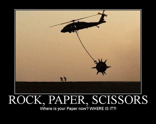
· File name for bad example: Jump

· Source of example: http://www.blackfive.net/photos/uncategorized/2007/06/18/20070613agenda_2.jpg
· Elements of design exhibited (or not exhibited): Bordering and Text
· Why you feel this item is ineffective: The image draws the veiwer away from the text which is meant to be the source of the joke. The font could have been different in order to be more catching, or a different color. The background is good because it highlights the image, but overall the eyes focus on the image and not the text.
· Who is the target audience? Anyone who understands and enjoys military humor.

So this was an interesting weekend. It started off with no internet, which is why I'm just now doing my blog. *Chuckles* Oh, well. Back to the subject though. Typography. Absolutely terrible holiday for those who are single, but great for those in a relationship. And also a great example for typography, mostly because there are literally THOUSANDS of types if font and script that come out during this "holiday". Mostly types of cursive, but others do come out. And though some are nicely placed, blended, and written, there are others that aren't. I've attached two images, one in cursive script and the other just a plain text, but one is much better laid out than the other. Personally, I prefer the winged one because the font is by itself, lends more eye appeal to the heart and wings, and is easy to read. The other is difficult to read and blends in with the border which takes away from what it says.


Followers
Contributors

- Kameron Sullivan
- I love cattle, teaching kids to show cattle, and competitive Marksmanship. Nothing is more soothing than scoring perfect 10's with a good gun. I also love falconry, and studying history.
