
First of all, this advertisement makes me laugh. I can’t decide if they are trying to say “Be Smart, Drink Smart (Don’t be like Jessica Simpson)”, or if they are actually trying to say “Hey, look at Jessica Simpson! She’s so smart! She may be drunk ,but at least she’s in the back of the truck with all of her clothes on!”
As far as beer commercials go, this one isn’t too bad. The text in the black space at the bottom should be bigger, because it’s hard to read at that size, and there is quite a bit more room in the box. With the name of “Stampede” though, I would have felt that the usual image of horses, or a large herd of cattle, or even a joking one with running people would have been a better way to go. The image of Jessica Simpson with her eyes glazed, mouth open and her shirt half undone might not have been the best way to go. The colors are nice though. There’s just something awkward about the whole thing.
Even though I don’t drink, I don’t find this ad very persuasive. Actually, for the intelligent viewer, I’d hope they would find it as a turn-off. The slogan is hard to find, as it’s the last of the tag-line. “Stampede Light, It’s Beer Plus.” Nowhere in this add does it say ‘plus what’? Sadly, there is no unison or synergy to this ad. It’s a girl that used to be considered extremely beautiful, and beer. But there is no link between them. It’s a sad ad.

World Wildlife Fund: text and symbol- The panda is a symbol of peace and friendship. The WWF uses this symbol, with its soft plush text, to invoke a feeling that the organization is a caring and compassionate organization with the world’s peace and harmony at heart. The symbolism is obviously meant to bring about a feeling of trust and willingness to contribute.
http://tv.adobe.com/watch/max-2008-design/working-smarter-with-photoshop-cs4-and-illustrator-cs4
1) Keep drawing. Von Glitschka stated that an artist should always start off, and keep on, drawing. He says that drawing not only helps you plan and decide what you are going to do and where you would like your art to go, but also can be moved to design software to be bumped up to the next level.
2) Be flexible. He started off with a suite called Free Hand that was his preference. But when it was bought out by Adobe, after a while Free Hand stopped operating. He was forced to learn to solely operate out of Adobe. When he did that, he said that he came to love Illustrator, which he uses for his industry.
3) A solidly established creative process is important.
4) Putting things together to create something takes time and effort. Glitschka said that putting things like vectors, gradients, and levels of opacity are sometimes difficult, but bring the overall project up to being a professional appearing product.
5) His building of the Obama caricature was extremely intricate and beyond anything that I could probably currently create. His use of the blending and layers tools with gradients was extremely interesting and I hope that one day I too can do something like that.


Design Principles – Lesson 6
Typography and Basic Design Principles Example Reflections
Include examples with this assignment
Save the examples in your assignment folder along with this reflection.
Good Example
· File name for good example: Churchill

· Source of example: http://to-so-few.livejournal.com/profile
· Elements of design exhibited: This is a World War II poster produced by the British. It has blending of text and an simple layout.
· Why you feel this item is effective: It has the powerful words of the British Prime Minister Winston Churchill, and even though printers were extremely primitive back then, this poster is still elegant., though slightly washed out. For it’s age and the period in which it was produced, I feel that this is a very good example of blending text into an image.
· Who is the target audience? British citizens circa WWII
Bad Example
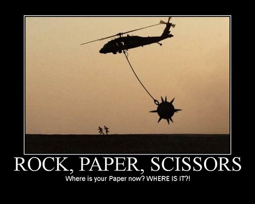
· File name for bad example: Jump

· Source of example: http://www.blackfive.net/photos/uncategorized/2007/06/18/20070613agenda_2.jpg
· Elements of design exhibited (or not exhibited): Bordering and Text
· Why you feel this item is ineffective: The image draws the veiwer away from the text which is meant to be the source of the joke. The font could have been different in order to be more catching, or a different color. The background is good because it highlights the image, but overall the eyes focus on the image and not the text.
· Who is the target audience? Anyone who understands and enjoys military humor.

So this was an interesting weekend. It started off with no internet, which is why I'm just now doing my blog. *Chuckles* Oh, well. Back to the subject though. Typography. Absolutely terrible holiday for those who are single, but great for those in a relationship. And also a great example for typography, mostly because there are literally THOUSANDS of types if font and script that come out during this "holiday". Mostly types of cursive, but others do come out. And though some are nicely placed, blended, and written, there are others that aren't. I've attached two images, one in cursive script and the other just a plain text, but one is much better laid out than the other. Personally, I prefer the winged one because the font is by itself, lends more eye appeal to the heart and wings, and is easy to read. The other is difficult to read and blends in with the border which takes away from what it says.


When it comes to altering pictures, one of my favorite alterations is sepia. There's just something.... nostalgic about it. It makes the image either appear old, or it gives it extra flair. Take a wedding picture for example. By making the image in sepia and maybe rounding the image with a dark rounding tool, for me it draws a smile, no matter what the couple looks like.


All of these images are native JPEG's that I pulled from my summer internship to Scotland. This is actually one of my favorite pictures that I have ever taken. I love the colors, and how vibrant they turned out. I centered the picture around the dog, which is on the edge of Loch Lomond. I used a combination of the shore, mountains, and the sky to frame the dog and the loch.
This one is from St. Giles Cathedral. I used the darkness of the cathedral to frame the angel that sits near the naive. I wish that the angel had been more lighted, but the marble absorbed the flash from the camera. I feel like it turned out almost ghostly.
 I laid on the ground to take this picture. The Ross Fountain is located in the Princes Street Gardens, and Edinburgh Castle is in the background of this image. I really enjoyed how the angle of this picture showed both, and captured the water from the fountain.
http://www.mate1.com/profiles/me/step1/c7589aj?sid=1b9cc0ba128d17b4
Contributors

- Kameron Sullivan
- I love cattle, teaching kids to show cattle, and competitive Marksmanship. Nothing is more soothing than scoring perfect 10's with a good gun. I also love falconry, and studying history.